
潮玩怪趣IP字标Logo设计生成指南
🤖 ChatGPT
🇺🇸 English Prompt
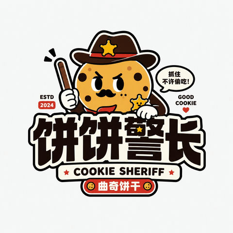
Please design a high-completion "Trendy Toy/Quirky IP Wordmark Logo" based on the [Brand Name/Project Name], [Subtitle/Product Name], [Type/Industry], [Brand Positioning], [Core Keywords], [Character Setting], [Emotional Tone], [Primary Color], [Secondary Color], and [Aspect Ratio] input by the user.

[User Input]
Brand Name/Project Name: [Brand Name/Project Name]
Subtitle/Product Name: [Subtitle/Product Name]
Type/Industry: [Type/Industry]
Brand Positioning: [Brand Positioning]
Core Keywords: [Cute, quirky, trendy toy, sticker feel, young, IP feel, funny, whimsical, adorable, brand feel, etc.]
Character Setting: [Animal / Anthropomorphic object / Quirky character / Food character / Space character / Trendy toy character, etc.]
Emotional Tone: [Adorable, grumpy cute, silly cute, neurotic, happy, lazy, tsundere cute, nonsense, light trendy, etc.]
Primary Color: [Primary Color]
Secondary Color: [Secondary Color]
Aspect Ratio: [Aspect Ratio]

[Core Goal]
What is being designed this time is a "Trendy Toy/Quirky IP Wordmark Logo" with genuine brand recognition. It is not an ordinary children's cartoon or a simple illustration, but rather an integration of "Character + Wordmark + Color + Sticker-style composition" into a complete Logo. The final effect should be a youthful, trendy toy Logo that can be directly used for packaging, stickers, social media avatars, store signs, merchandise, and brand visual master marks.

[Design Essence]
The focus of such a Logo is not just to draw a cute character, but to complete the following integration:
1. A highly recognizable, quirky, and cute core character;
2. An eye-catching, bold, impactful Chinese wordmark;
3. Auxiliary English title or subtitle to enhance the trendy toy packaging feel;
4. High-saturation flat color scheme and bold black outlines;
5. The overall look should be like a sticker, trendy toy packaging, or IP brand mark, not an ordinary illustration.

[Most Important Principles]
1. The character must be the main memory point, but it cannot be just decorative illustration;
2. Text must be clear and possess a Logo nature;
3. Character and wordmark must have an interactive relationship, forming a whole, not just stacked top-to-bottom;
4. Style must be youthful, quirky, and shareable, not childish or tacky;
5. Must have "sticker feel, trendy toy feel, IP feel," not a traditional corporate Logo;
6. Color scheme must be bright, bold, and memorable;
7. Image must be clear, simple, and complete, suitable for small-size dissemination;
8. Can mix Chinese and English, but Chinese or brand name must be clear and eye-catching.

[Character System Requirements]
Please design a quirky, adorable, and audience-friendly cartoon character around the [Character Setting]. Characters can be:
- Anthropomorphic animals: cat, dog, bear, monkey, rabbit, fish, crocodile, etc.;
- Anthropomorphic objects: milk carton, cookie, drink, toothpaste, cake, spaceship, weapon, tool, etc.;
- Hybrid characters: animal + food, animal + object, food + expression, monster + toy, etc.
Character Requirements:
1. Shape is simple, exaggerated, cute, and interesting;
2. Expressions must have a memory point, such as dull, sassy, silly, lazy, smirk, grumpy cute;
3. Must have strong silhouettes, suitable for brand marks;
4. Must have a bit of whimsy or contrast;
5. Lines should be as simple as possible, flat style, not realistic;
6. Character can be hugging, holding, sitting on, leaning on, poking out of, or pressing on the wordmark;
7. Character should directly participate in the Logo composition, not standing independently on the side.

[Wordmark System Requirements]
1. Chinese brand name or main title must be eye-catching;
2. Font should be thick, black, and have weight, like packaging title fonts or trendy toy brand fonts;
3. Can have slight deformation, but don't over-embellish;
4. Suitable for interleaving, overlapping, surrounding, or combining with the character;
5. English can be used for curved titles, auxiliary titles, sub-explanations, small slogans, years, etc.;
6. English style can be bold, uppercase, toy packaging feel, sticker feel;
7. Overall should form a complete hierarchy of "Character + Big Chinese Characters + Auxiliary English."

[Composition Requirements]
The overall composition should have a distinct "Trendy Toy Sticker Logo" feel. Refer to the following structures:
1. Character on top, Chinese wordmark at the bottom, English small text as auxiliary;
2. Character pressing on the text or poking out from the text;
3. Arc-shaped English above + Character in the middle + Chinese wordmark below;
4. Character and text form an overall outline, like a brand sticker;
5. Can add small labels, small years, small symbols, small stamps to enhance the packaging feel.
Overall Requirements:
- Subject centered;
- Structure clear;
- Relationship between character and text is explicit;
- Easy to identify after shrinking.

[Visual Style Requirements]
1. Use flat color blocks;
2. Use obvious thick black outlines;
3. Color scheme is high-saturation and impactful;
4. Overall has trendy toy feel, sticker feel, packaging feel;
5. Image can have a bit of nonsense and funny feel;
6. Lines are clean, no complex shadows;
7. No real materials, no 3D realistic feel.

[Color Requirements]
It is recommended to use 2~5 primary colors, overall high saturation and youthful.

[Auxiliary Element Requirements]
A small amount of trendy toy packaging-style auxiliary elements can be added, but must be restrained, cannot make the picture into a poster.

[Visual Presentation Requirements]
1. This is an independent Logo display image, not a poster;
2. Background is clean, white background, light gray background, or beige background is recommended;
3. Subject is clear and complete, character and wordmark integrated;
4. Style is consistent, high recognition;
5. Suitable for use in packaging, avatars, stickers, shop signs, merchandise, and social media dissemination.

[Acceptance Criteria]
Please ensure the final result meets:
1. Character can be remembered at a glance;
2. Brand name can be seen clearly at a glance;
3. Character and wordmark are a whole;
4. Overall has sticker feel, trendy toy feel, IP feel;
5. Color scheme is bright, youthful, and has audience appeal;
6. Suitable for main brand Logo, not just simple illustration;
7. Has a sense of dissemination and social media friendliness.

[Output Requirements]
Please output a high-completion "Trendy Toy/Quirky IP Wordmark Logo" that uses a quirky and cute character as the core, thick black wordmark as the structure, and high-saturation flat color and sticker-style composition as the expression method, forming a youthful, trendy, shareable, and brandable complete Logo.
🇨🇳 中文提示词
请根据用户输入的【品牌名 / 项目名】【副标题 / 产品名】【类型 / 行业】【品牌定位】【核心关键词】【角色设定】【情绪气质】【主色调】【辅助色】【画幅比例】,设计一个高完成度的「潮玩怪趣 IP 字标 Logo」。

【用户输入】
品牌名 / 项目名:【品牌名 / 项目名】
副标题 / 产品名:【副标题 / 产品名】
类型 / 行业:【类型 / 行业】
品牌定位:【品牌定位】
核心关键词:【可爱、怪趣、潮玩、贴纸感、年轻、IP感、搞怪、脑洞、呆萌、品牌感等】
角色设定:【动物 / 拟物 / 怪趣角色 / 食物角色 / 宇宙角色 / 潮玩角色等】
情绪气质:【呆萌、暴躁萌、傻萌、神经质、快乐、懒懒的、嘴硬可爱、无厘头、轻潮流等】
主色调:【主色调】
辅助色:【辅助色】
画幅比例:【画幅比例】

【核心目标】
这次要设计的是一个真正具有品牌识别度的「潮玩怪趣 IP 字标 Logo」。它不是普通儿童卡通,也不是单纯插画,而是要把“角色 + 字标 + 色彩 + 贴纸感构图”整合成一个完整 Logo。最终效果应像一个可以直接用于包装、贴纸、社交头像、门店招牌、周边商品和品牌视觉主标的年轻化潮玩 Logo。

【设计本质】
这类 Logo 的重点不是只画一个可爱角色,而是要完成以下整合:
1. 一个高辨识度、怪趣可爱的核心角色;
2. 一个醒目、粗黑、有冲击力的中文字标;
3. 辅助英文标题或副标题,增强潮玩包装感;
4. 高饱和扁平配色和黑色粗描边;
5. 整体像贴纸、潮玩包装、IP品牌标志,而不是普通插画。

【最重要的原则】
1. 角色必须是主记忆点,但不能只是装饰插画;
2. 文字必须清晰,具备 Logo 性质;
3. 角色与字标必须有互动关系,形成一个整体,而不是上下拼接;
4. 风格必须年轻、怪趣、可传播,不能低幼或土气;
5. 要有“贴纸感、潮玩感、IP感”,而不是传统企业 Logo;
6. 配色要明快、大胆、有记忆点;
7. 画面要清晰、简洁、完整,适合小尺寸传播;
8. 可以中英混排,但中文或品牌名必须清楚醒目。

【角色系统要求】
请围绕【角色设定】设计一个怪趣、呆萌、有观众缘的卡通角色。角色可以是:
- 动物拟人:猫、狗、熊、猴、兔、鱼、鳄鱼等;
- 拟物角色:奶盒、饼干、饮料、牙膏、蛋糕、飞船、武器、工具等;
- 混合角色:动物+食物、动物+物件、食物+表情、怪物+玩具等。

角色要求:
1. 造型简洁、夸张、可爱、有趣;
2. 表情必须有记忆点,例如呆、拽、傻、懒、坏笑、暴躁萌;
3. 要有强轮廓,适合做品牌标志;
4. 要有一点脑洞或反差感;
5. 线条尽量简洁,偏扁平,不要写实;
6. 角色可以抱着、举着、坐在、靠着、探出、压住字标;
7. 角色应直接参与 Logo 构图,而不是独立站在旁边。

【字标系统要求】
1. 中文品牌名或主标题必须醒目;
2. 字体要粗、黑、有重量感,像包装标题字或潮玩品牌字;
3. 可以有轻微变形,但不要过度花哨;
4. 适合与角色进行穿插、叠压、环绕或组合;
5. 英文可用于弧形标题、辅助标题、副说明、小口号、年份等;
6. 英文风格可偏粗体、大写、玩具包装感、贴纸感;
7. 整体应形成“角色 + 中文大字 + 英文辅助”的完整层级。

【构图要求】
整体构图应具有明显的“潮玩贴纸 Logo”感。可参考以下结构:
1. 角色在上,中文字标在下,英文小字辅助;
2. 角色压在字上或从字中探出;
3. 上方弧形英文 + 中间角色 + 下方中文字标;
4. 角色与字形成整体轮廓,像一枚品牌贴纸;
5. 可加小标签、小年份、小符号、小印章增强包装感。

整体要求:
- 主体集中;
- 结构清晰;
- 角色和文字关系明确;
- 缩小后依然容易识别。

【视觉风格要求】
1. 使用扁平化色块;
2. 使用明显粗黑描边;
3. 配色高饱和、有冲击力;
4. 整体有潮玩感、贴纸感、包装感;
5. 画面可以有一点无厘头和搞怪感;
6. 线条干净利落,不要复杂阴影;
7. 不要真实材质,不要 3D 写实感。

【色彩要求】
建议使用 2~5 个主色,整体高饱和、年轻化。

【辅助元素要求】
可加入少量潮玩包装式辅助元素,但必须克制,不能让画面变成海报。

【画面呈现要求】
1. 这是独立 Logo 展示图,不是海报;
2. 背景干净,建议白底、浅灰底、米白底;
3. 主体清晰完整,角色与字标一体化;
4. 风格统一,辨识度高;
5. 适合用于包装、头像、贴纸、门头、周边和社交媒体传播。

【验收标准】
请确保最终结果满足:
1. 一眼能记住角色;
2. 一眼能看清品牌名;
3. 角色和字标是一个整体;
4. 整体有贴纸感、潮玩感、IP感;
5. 配色鲜明、年轻、有观众缘;
6. 适合做品牌主 Logo,而不是单纯插画;
7. 有传播感和社交媒体友好度。

【输出要求】
请最终输出一个高完成度的「潮玩怪趣 IP 字标 Logo」,它必须以怪趣可爱的角色为核心,以粗黑字标为结构,以高饱和扁平配色和贴纸感构成为表现方式,形成一个年轻化、潮玩化、可传播、可品牌化的完整 Logo。